E-Learning Module
Applying graphic design principles into practice
This project was completed as part of the Digital Skills for Learning Designers course. The aim of the course was to hone proficiency and ability to navigate digital tools that can aid in the development of digital learning experiences. In this assignment, we were tasked to design our own e-learning module, learning app or educational game and document our process using Adobe Photoshop. The projects were done individually and lasted over the course of four weeks.
Developing Wireframes
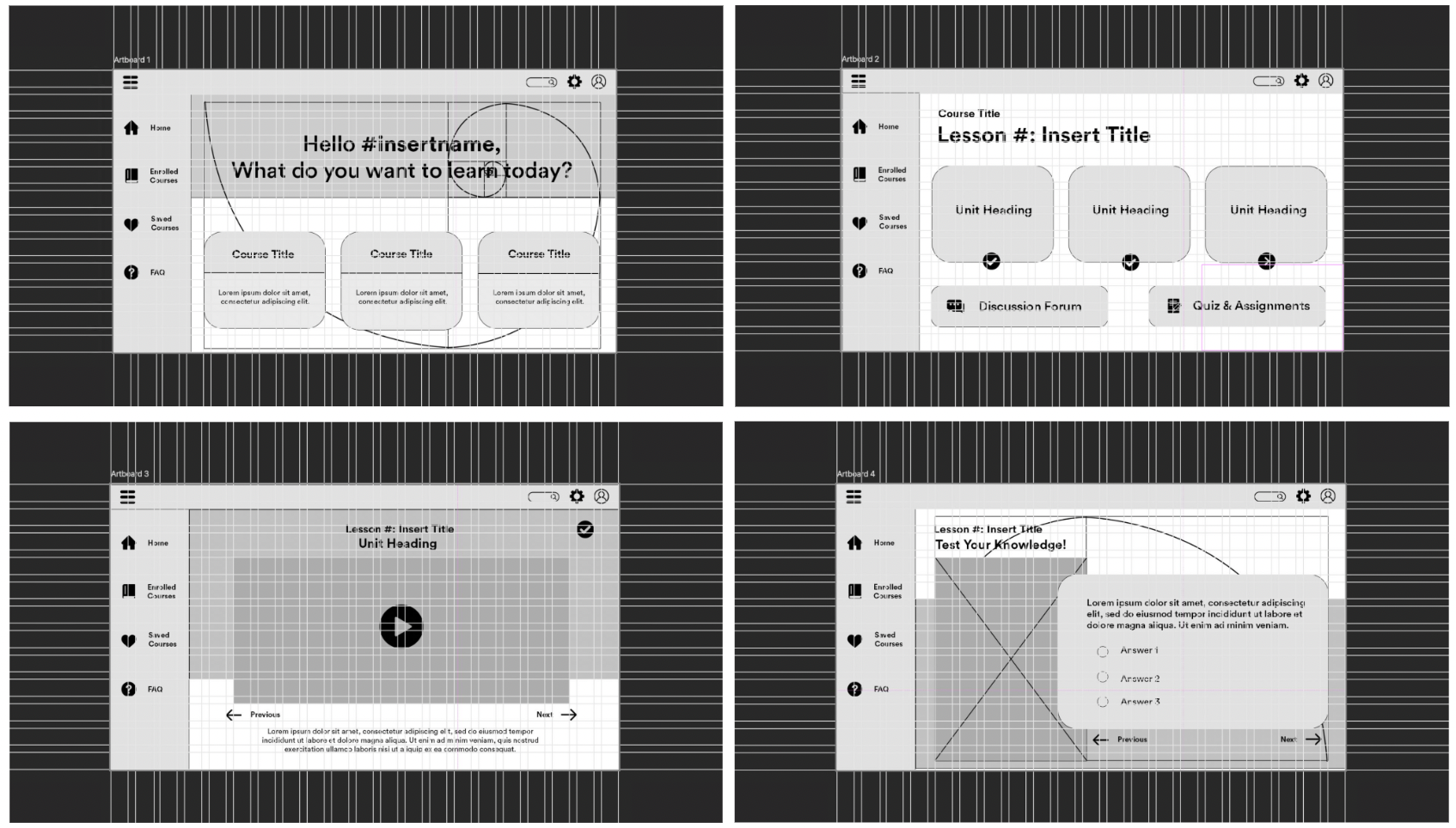
I started my design journey by reflecting upon my past experiences with e-learning modules, and trying to configure what I felt was working – and what could be improved. During the development process, I had three guiding thoughts:

The module supports knowledge building.
I wanted my e-learning module to cater to a content or a learning experience that requires the information to be learned to be chunked into segments. I foresee that this design will work best when the material to be learned can be broken down into a sequence; this can range from learning about the principles of branding to a lesson on knitting or cooking. Basically, a combination between knowing ‘what’ and knowing ‘how’.
01
The module encourages autonomy.
The design is intended to allow users to have some sort of control over what they are learning. This is why the first pages of the design focuses on providing users with options. Once they enter the content or lesson page, I want to provide users with actions such as marking a section to be complete or being able to toggle between previous and next lesson units.
02
The design is clear and focused.
Generally speaking, the design draws on elements and principles of photography – I wanted to create a focal point where users can focus their attention throughout each page of the modules. Reflecting upon my own experience, many learning modules are too cluttered – there is either simply too much going on in each of its pages or requires me to scroll through the page to see where everything is at. This is why I designed the forum and quiz pages as a separate element from the lesson units.
03
Applying Grids and Proportions
The wireframes taught us basic concepts of layout and composition. In the second week, our task was to refine our original design based on the rules of grids and proportions. The goal was to assign the right places for all the elements in our design. The two principles that I applied were:

Rule of Thirds and Symmetry
Each underlying grid tries to follow the rule of thirds – as a blank artboard, each frame was divided into nine sections. The frames was designed using a guide of 21 columns and 12 rows – each with 20px gutter to give room for enough white space between each components. The use of rule of thirds and division of guides by number of threes also creates symmetry in the page. The intention is to help users focus on each components as they move through the page without too many distractions.
Golden Ratio
Two of the wireframes – the front page and quiz/assignment page attempts to follow the golden ratio rule. The intention is to create a point of focus and create harmony. In the first page, the intention is to create proportion between the header and the course selection. The golden ratio will be used as a guidance to determine to background image in the header. In the quiz/assessment page, the ratio is used to divide the proportion between the visual aid that will be used in the quiz and the question and answer section.

Typography and Colors
The third week of the course focuses on adding aesthetic elements to our design. For this, we were tasked to apply the principles of typography and color compositions. There were three key design decisions that I made pertaining to both elements:
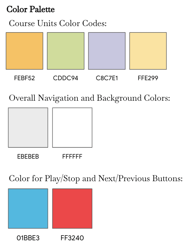
Color Palette
The color palette was actually inspired by the first header in the main landing page. The idea is to use colors from the picture and incorporate them onto other pages without being too obvious. The background images in the content and quiz/assignment pages corresponds to the number of unit (for now, orange for unit #1 and green for unit #2). I chose relatively softer, more pastel colors to provide a clean, simple look. In certain case, the bright colors will be used to drive attention. In the second frame, grayscale images indicates units that have been completed.
Tone and Manner
Far If I were to give a theme to the design, I want my e-learning module to be “vibrant, yet familiar”. The design is meant to combine real life photos and colors without being too overwhelming. At the same time, I don’t want to the design to feel “fluid”, in a sense that the design actually utilizes patterns of colors and typography without being too redundant.
Typeface Selection
The typography that I selected combines both Serif and Sans Serif. The intention behind mixing the two is to provide a sense of guidance and orientation, as well as hierarchy. Use of italic and bold typeface is to provide focus and guidance for action.

Final Design

Acknowledgements:
Courses
EDCT-GE – 2076 Technical Studio: Digital Skills for Learning Designers
Professor
Xavier Ochoa